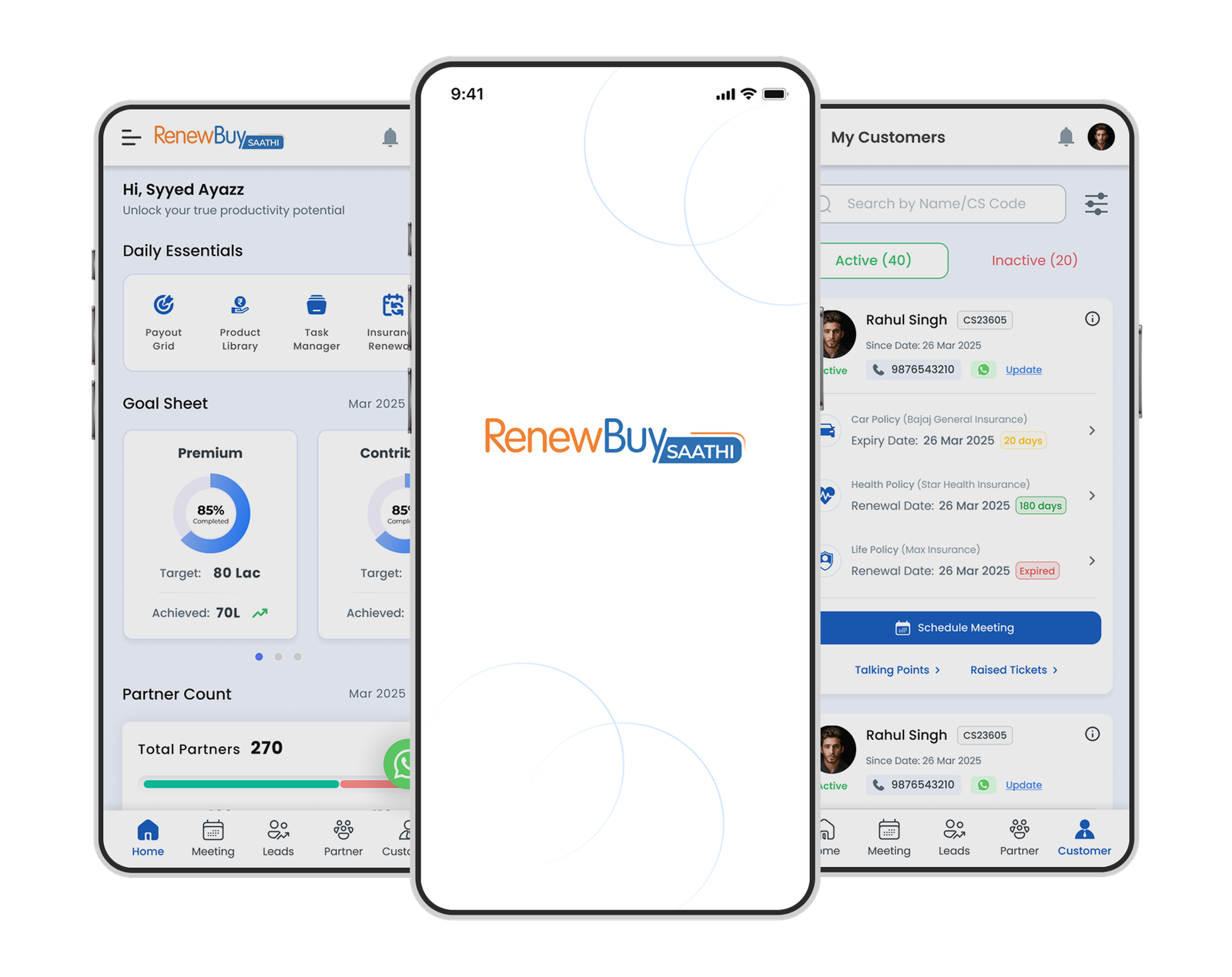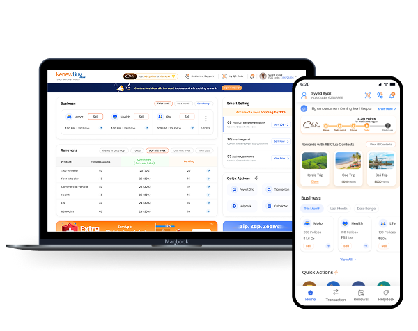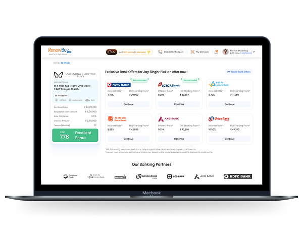
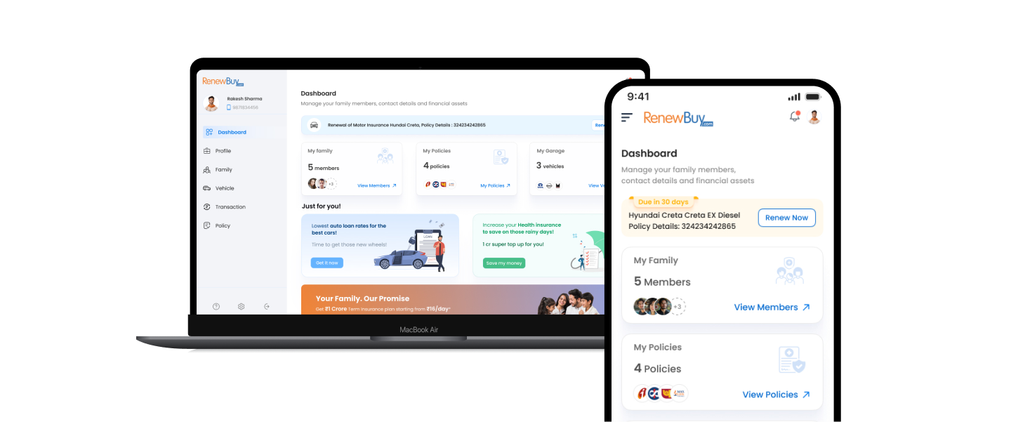
This project aims to develop a user-friendly and comprehensive web plateform that streamlines the insurance experience for customers. In today’s india almost 650 million people are using smartphones. Customers lack a comprehensive and engaging platform built on Manage It Yourself philosophy for their insurances, essential services, and financial needs.
RenewBuy’s current B2B2C model limits direct customer control, requiring advisors for every transaction—from purchasing to policy management. This creates friction for customers who want self-service options and prevents the company from building direct relationships with end users. To address this challenge, we developed an integrated platform (web portal and mobile app) that enables customers to independently purchase, manage, and update their insurance and financial products while giving RenewBuy direct access to customer insights and market opportunities.
We designed a comprehensive web platform that enables customers to purchase, manage, and claim insurance policies independently. The platform includes family management, vehicle management and real-time services (challans, FASTag, PUCC), new car loan application & tracking, and other direct customer support. This multi-functional approach increases engagement while providing RenewBuy valuable opportunities for cross-selling new products.
We conducted qualitative research with 10-15 participants through phone calls and in-person meetings across Delhi NCR. This comprehensive approach helped us gather diverse perspectives from actual users, uncovering valuable insights about their insurance needs, pain points, and expectations for mobile experiences.
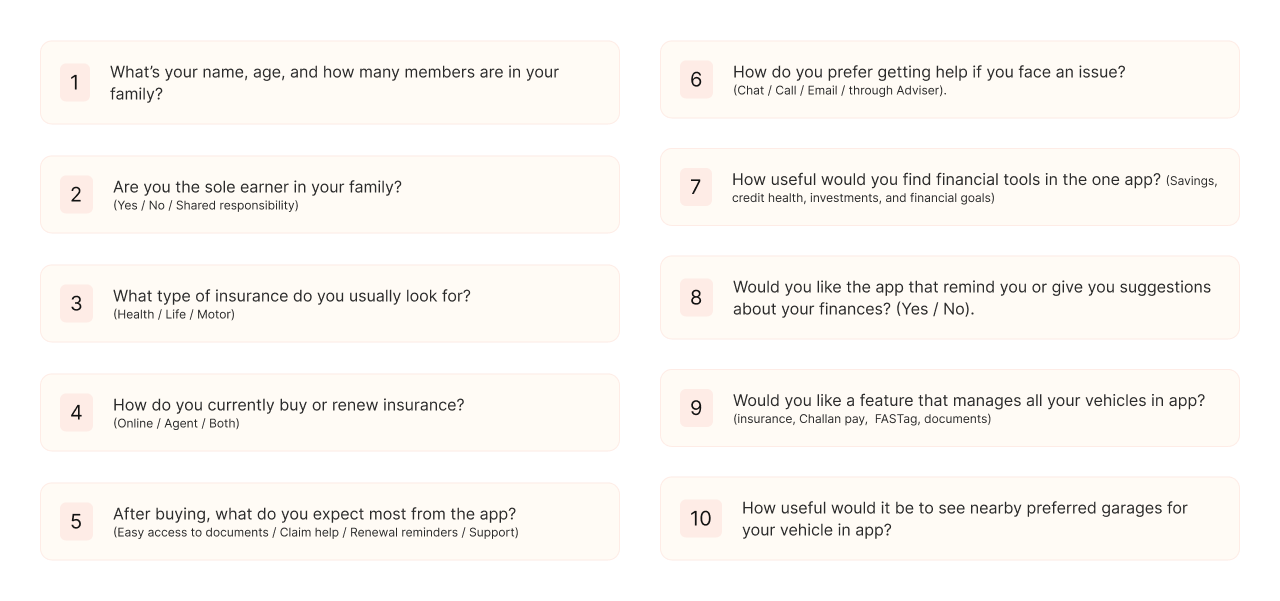
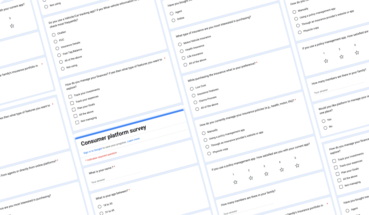
We conducted quantitative research with 100+ users through Google Forms surveys and promotional voucher campaigns to gather broader insights. This large-scale feedback collection helped us validate initial findings from qualitative research and identify common user preferences, needs, and behavioral patterns across diverse user groups.
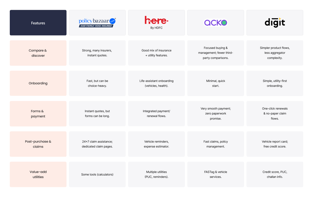
We conducted comprehensive competitive analysis studying major players including PolicyBazaar, Insurance Dekho, TurtleMint, and HDFC Ergo’s mobile apps. This research helped identify industry best practices, feature gaps, and differentiation opportunities, enabling us to design a superior user experience that addresses unmet market needs.
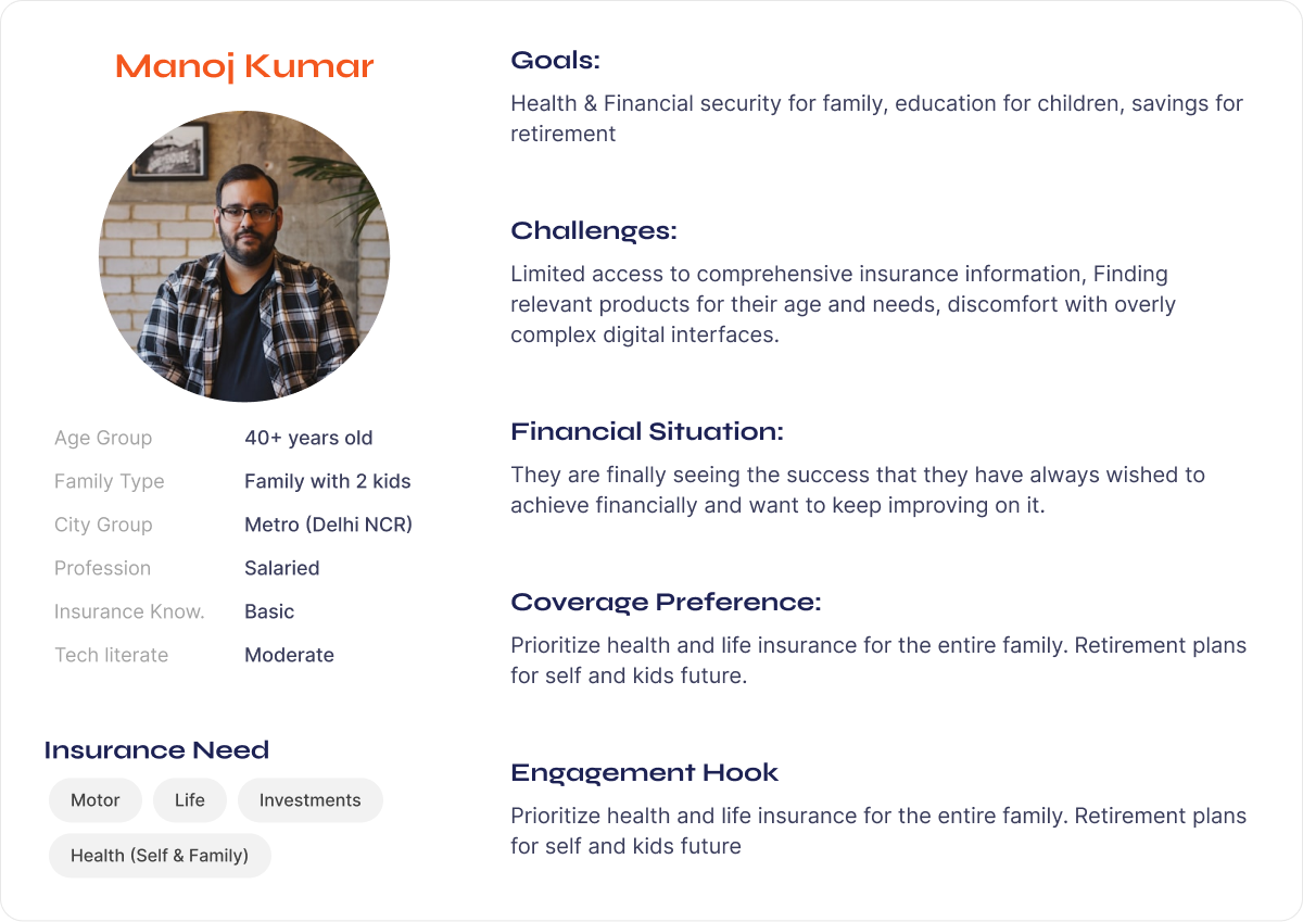
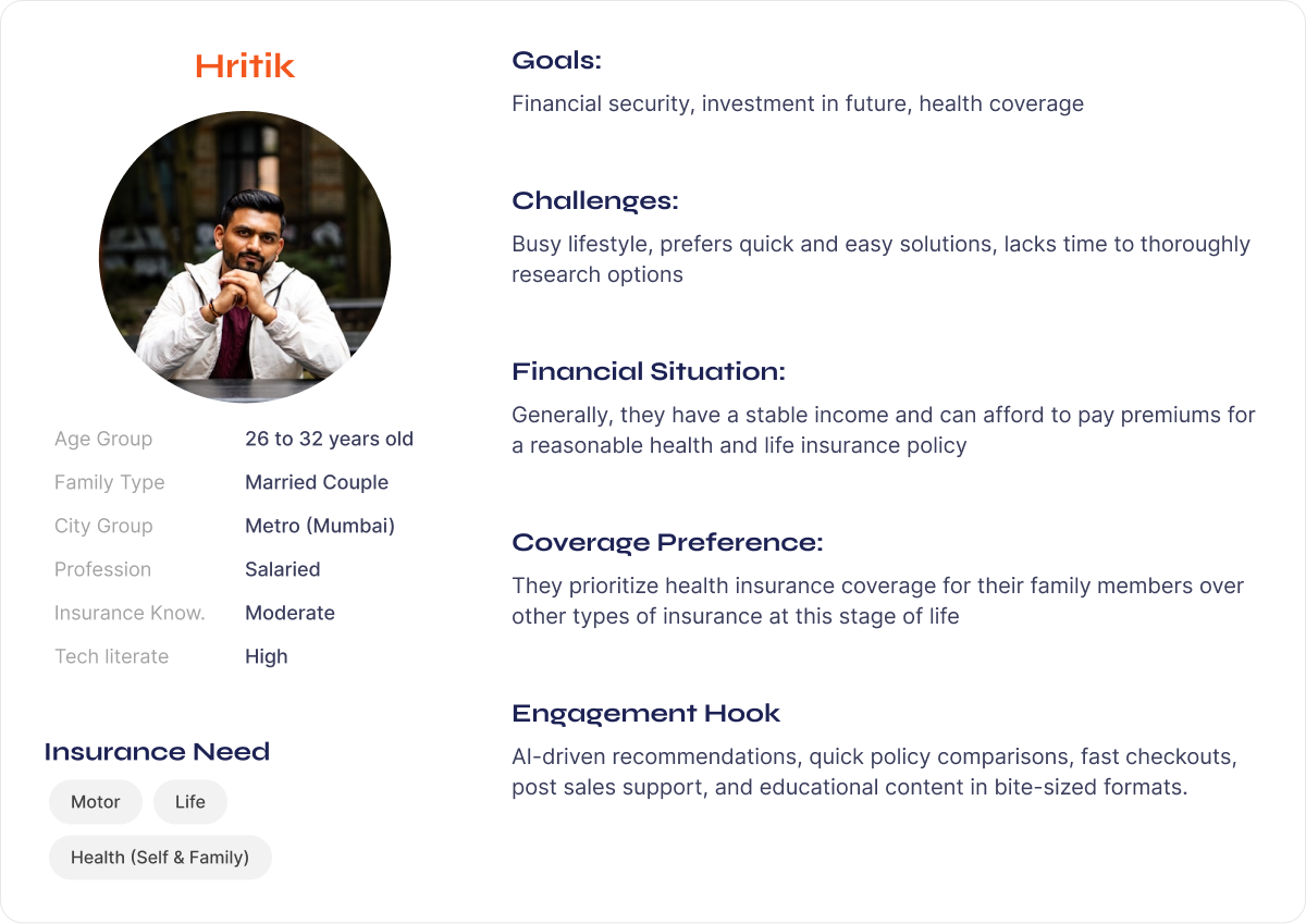
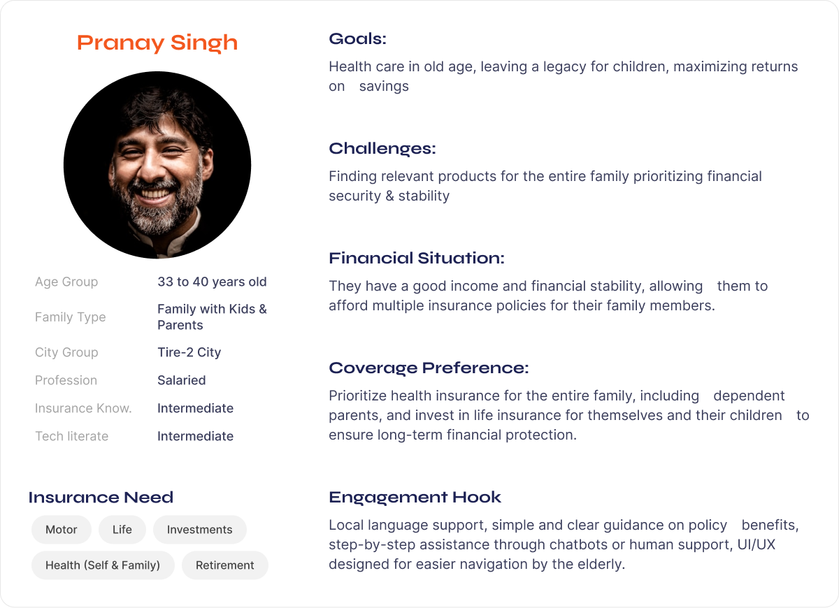
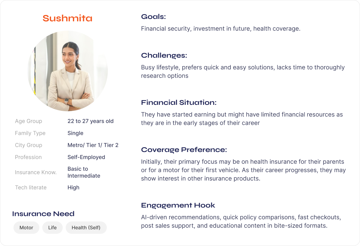
We developed detailed user personas based on insights from user interviews, surveys, and stakeholder sessions. These profiles captured diverse customer segments—like busy professionals managing family policies and first-time buyers seeking simple insurance options—highlighting their goals, challenges, and preferences.
We finalized the app’s core features through collaborative sessions informed by user research, competitive analysis, and stakeholder feedback. This data-driven approach ensured features like streamlined policy management and real-time services were user-centric and practical. By factoring in technical feasibility from the start
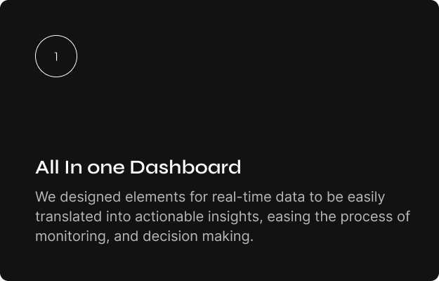
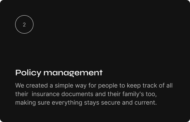
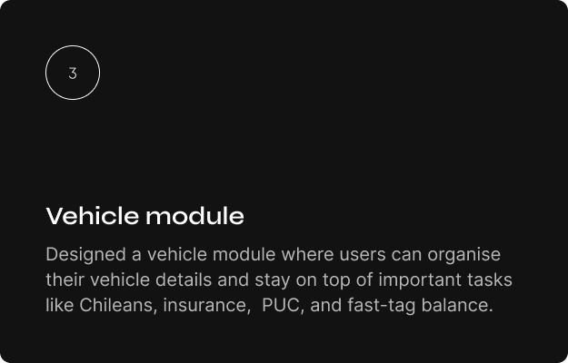
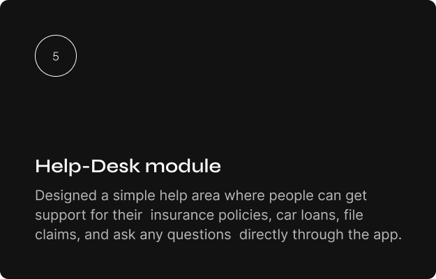
We collaborated with stakeholders and product managers to build the app’s information architecture, organizing content and navigation for optimal user experience. This joint effort defined clear hierarchies for features like policy management, vehicle services, and financial tools, ensuring intuitive access and scalability.
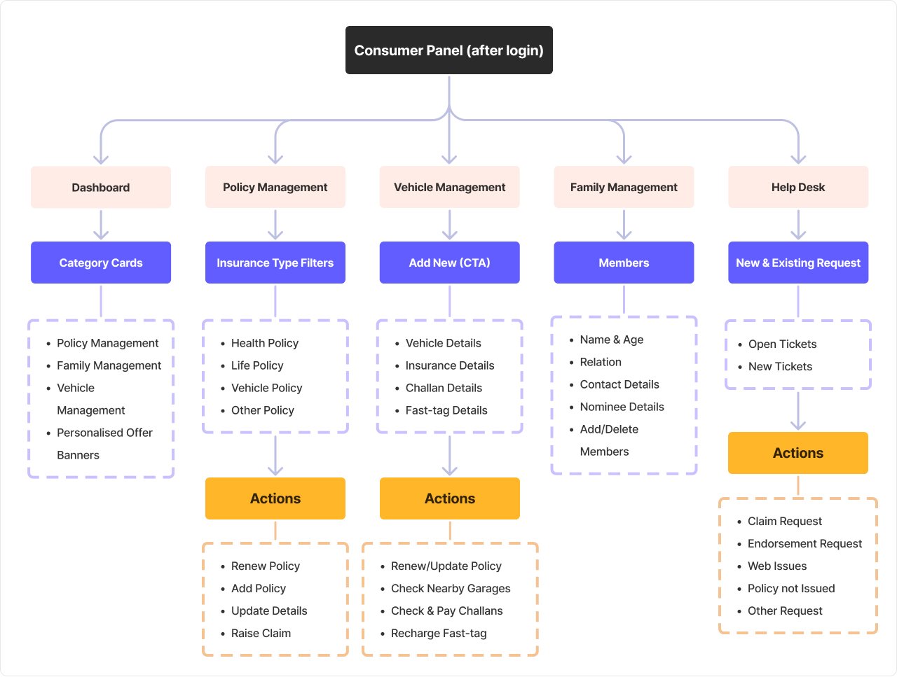
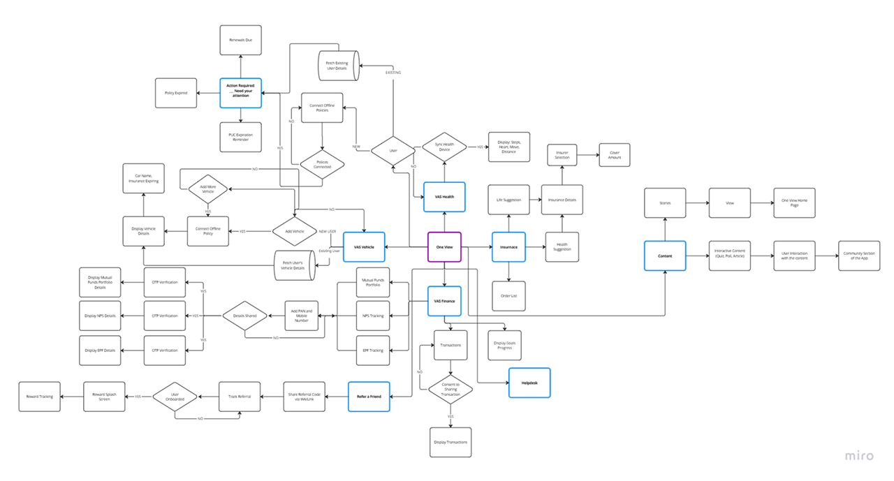
We collaborated with product managers and stakeholders to create detailed user flows in Miro for the new app. This interactive session helped map out key journeys—from policy purchase to claims processing—ensuring alignment on user needs and technical feasibility.
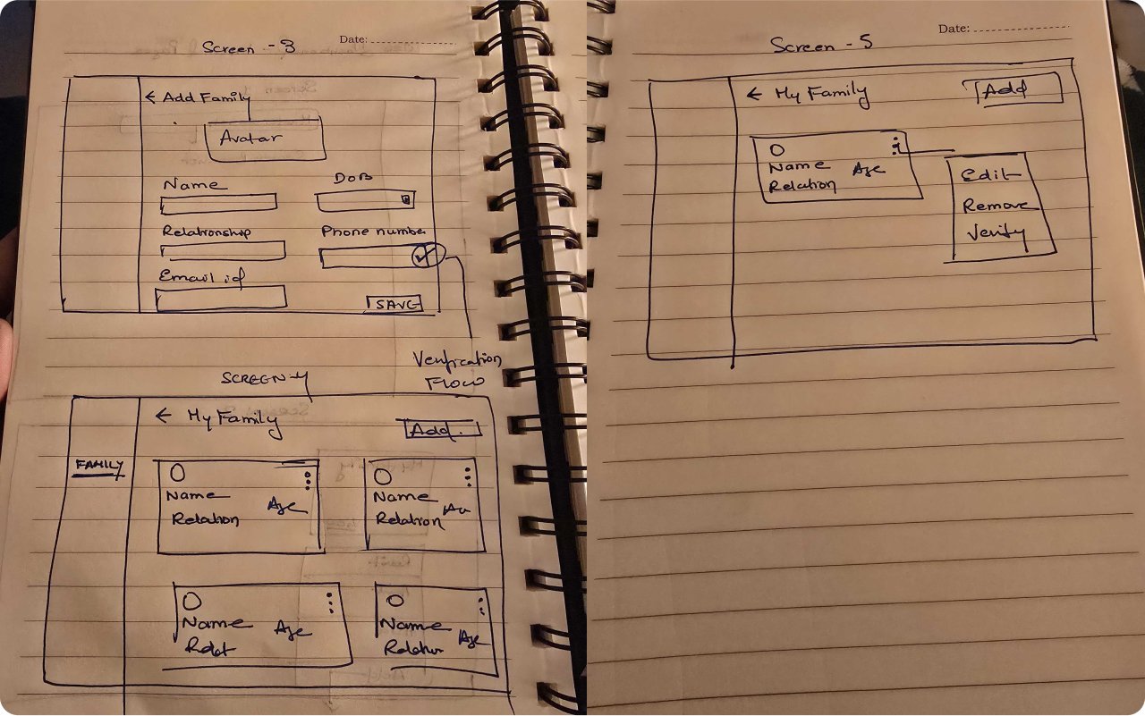
The sketching ideas for the app’s layout and features, allowed us to explore different design
concepts. We created wireframes to establish the app’s flow, ensuring a smooth experience
before the final design.
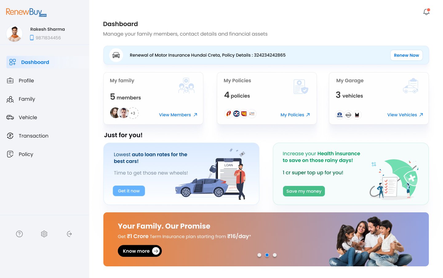
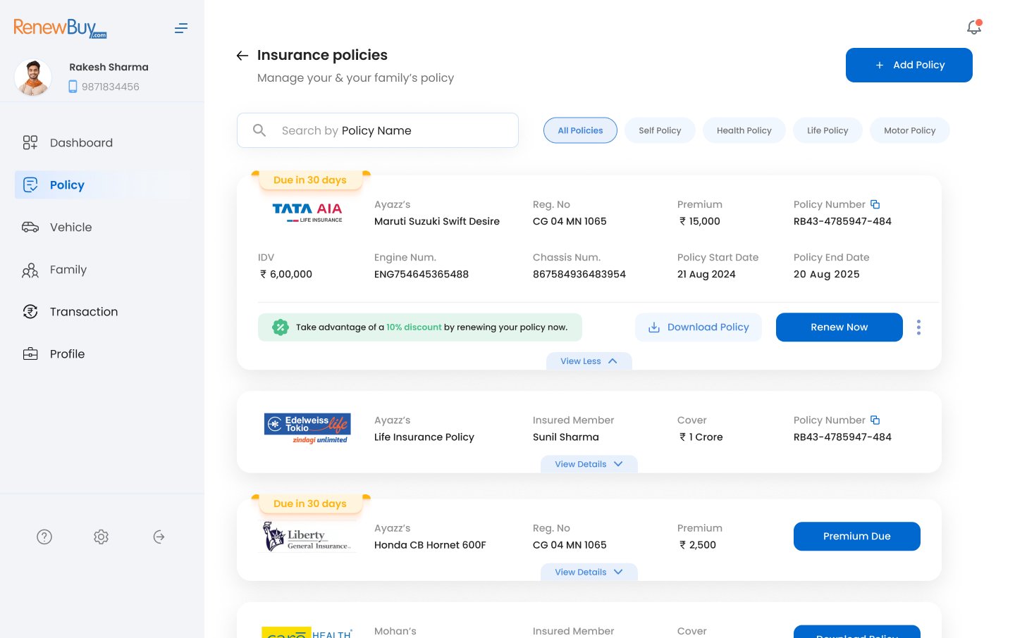
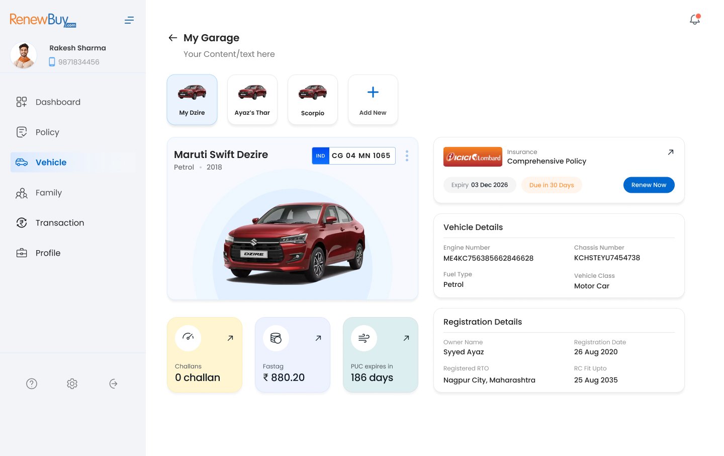
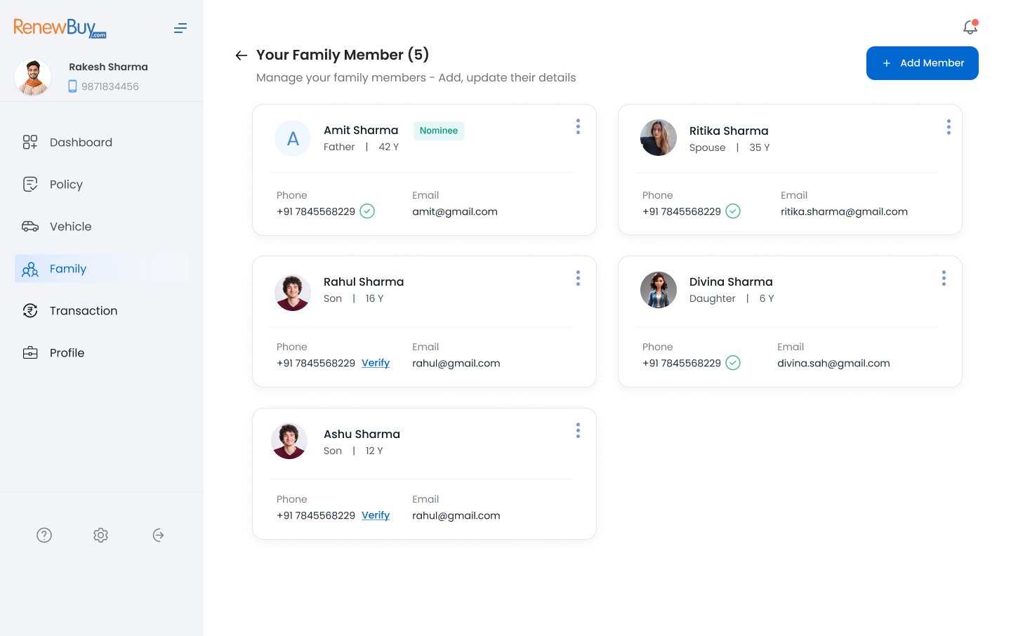
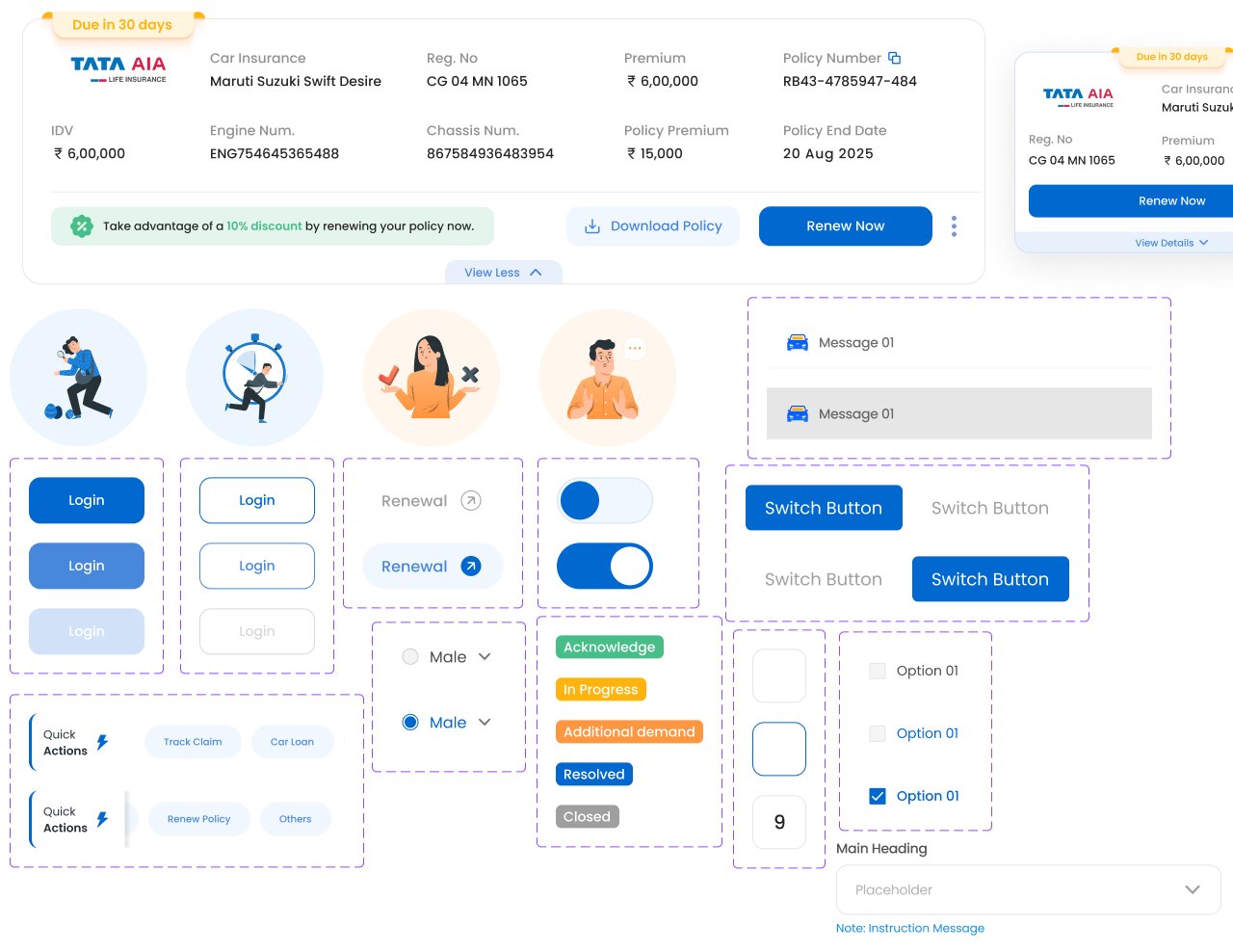
Our design system ensures that all elements, such as buttons and icons, look consistent. This
helps provide a smooth user experience as users navigate through assessments.

Some of the information, visuals, and details presented in this case study have been modified, simplified, or generalized to respect confidentiality and protect the privacy of company projects. The case studies and examples are intended solely to showcase my design process, skills, and approach, without disclosing any sensitive or proprietary business information.